Why Your CV Design Matters More Than You Think (A 2025 Guide)
We often spend countless hours perfecting the content of our CVs—choosing the right action verbs, quantifying our achievements, and tailoring every bullet point. While the content is undeniably king, many job seekers in India make the critical mistake of underestimating the power of design. The popular saying, "the first impression is the last impression," holds incredibly true for your resume. Before a recruiter reads a single word about your experience, their eyes absorb the overall layout, font, and structure of the document. A clean, professional design instantly signals competence and attention to detail, while a cluttered, unprofessional design can create a negative bias, regardless of how qualified you are. This guide will explore why your CV design matters more than you think in 2025 and break down the key elements of a professional design that impresses both human recruiters and robotic gatekeepers (ATS).
The Psychology of Design: A Recruiter's Perspective
To understand the importance of design, you need to think like a recruiter who sifts through hundreds of CVs daily.
- Readability is Everything: Recruiters don't read CVs; they scan them in a "F" or "Z" pattern, looking for keywords and key information in about 6-7 seconds. A good design with clear headings, scannable bullet points, and ample white space makes this process effortless. A poorly designed CV with large blocks of text is a chore to read and is likely to be discarded.
- It Reflects Your Professionalism: The design of your CV is a direct reflection of you as a professional. A well-organized, consistent, and error-free layout suggests that you are a meticulous, organized, and detail-oriented individual. A sloppy design suggests the opposite.
- It Creates a Personal Brand: Your CV is a marketing document. The font, colors, and layout you choose contribute to your personal brand. A modern, clean design positions you as a modern professional, while an outdated design using Comic Sans or Times New Roman can make you seem out of touch.
Key Elements of a Professional CV Design
You don't need to be a graphic designer to create a beautiful CV. You just need to follow these fundamental design principles.
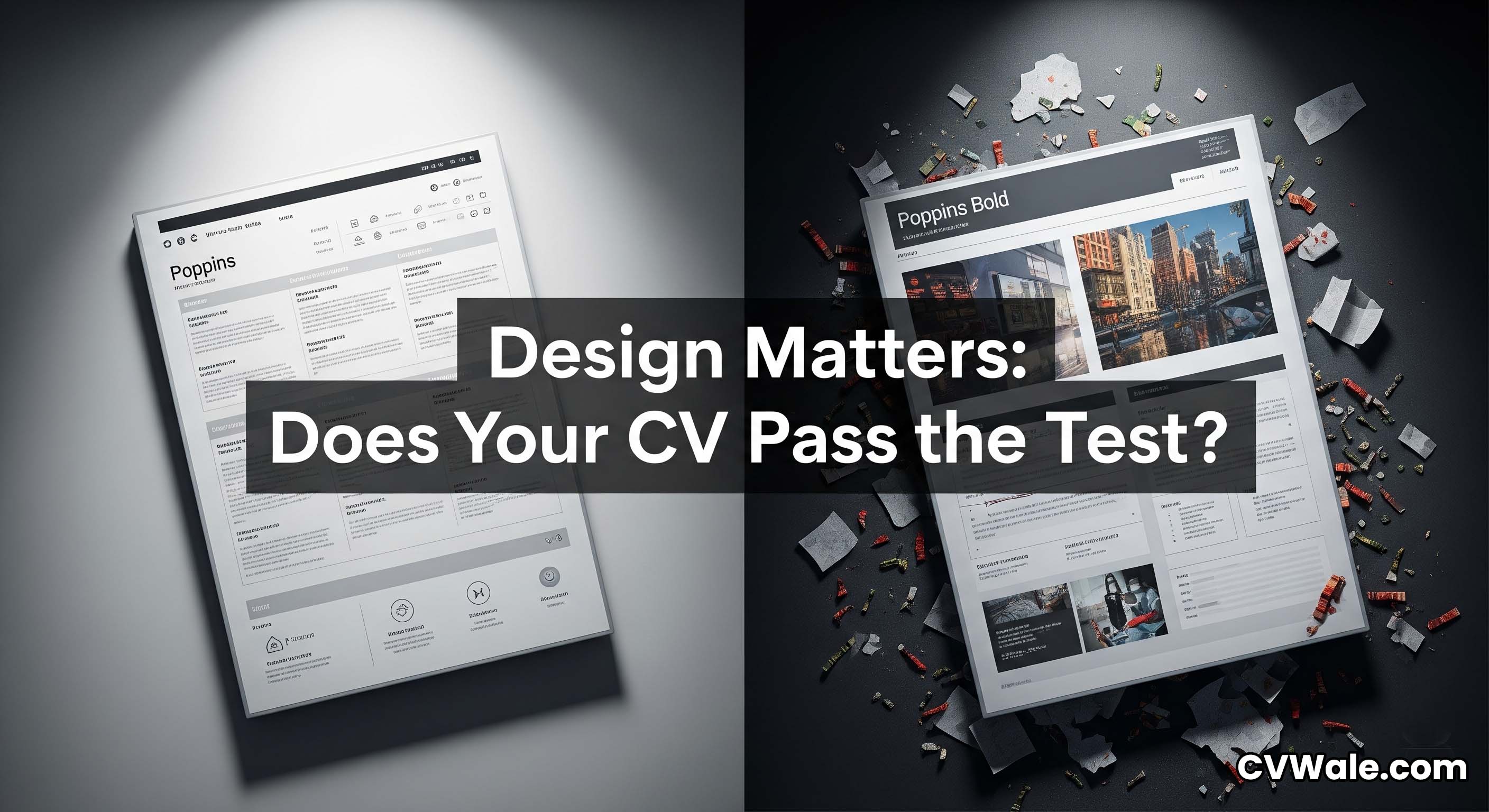
1. Fonts: Readability and Professionalism
Your font choice is critical. Stick to professional and widely recognized sans-serif fonts that are easy to read on-screen. Good choices include Poppins, Arial, Calibri, Helvetica, Verdana, and Roboto. Use a font size between 10 to 12 points for the body text and 14 to 16 points for headings. Limit yourself to a single font family for the entire document to maintain a clean and consistent look.
2. White Space: The Art of "Breathing Room"
White space (or negative space) refers to the empty areas on the page, such as the margins and the space between sections and lines. It is one of the most important elements of a good design. Ample white space prevents your CV from looking cluttered and overwhelming, making it far easier for a recruiter to scan and digest the information.
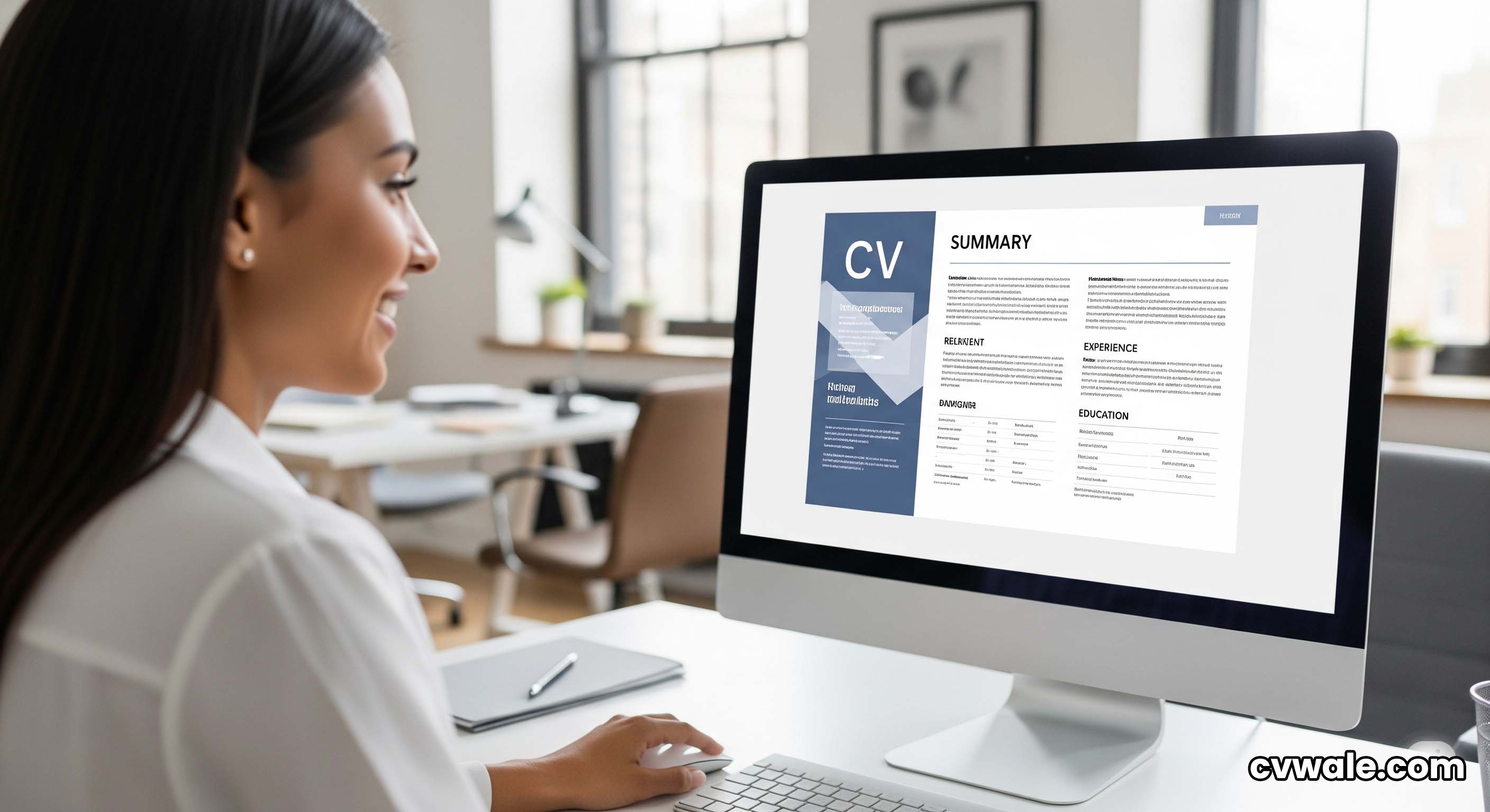
3. Clear Section Headings and Visual Hierarchy
A strong visual hierarchy guides the recruiter's eye to the most important information first. Use clear, bold headings for your main sections ("Work Experience," "Education," "Skills"). These headings should be slightly larger than your body text. This simple technique breaks the document into logical, scannable chunks and allows a hiring manager to quickly navigate to the section that interests them most.
4. Consistency is Key
Inconsistency is a major sign of a poorly crafted CV. Ensure that your formatting is consistent throughout the document. This includes:
- Date Formats: If you use "Jan 2020 – Dec 2022," use that format for all your entries.
- Bullet Points: Use the same style of bullet points for all your lists.
- Alignment: Keep your text alignment (usually left-aligned) consistent.
5. Use of Color: Less is More
While a completely black-and-white CV can look a bit dull, it's important to use color sparingly and professionally. A single, subtle accent color (like a dark blue, grey, or burgundy) for your name, headings, or links can add a touch of modern elegance. Avoid bright, distracting colors like neon green or hot pink, which can look unprofessional.
The ATS Challenge: Why Overly Creative Designs Fail
A common mistake, especially in creative fields, is to create a highly visual CV with lots of graphics, images, and unconventional layouts. While this might look impressive, it's often a disaster for Applicant Tracking Systems (ATS). These software systems are designed to parse text, not complex visual elements. A CV with text in columns, tables, or embedded in images will likely be misread or rejected by the ATS, meaning your application never gets seen by a human. For most roles, clarity and ATS-compatibility should always be prioritized over flashy design.
The Easiest Solution: Use a Professional Template
Not everyone has the time or skill to design a CV from scratch, and that's perfectly fine. The simplest and most effective way to ensure your CV has a clean, professional, and ATS-friendly design is to use a pre-made template from a trusted source. The templates available on CVWale have been expertly designed to be:
- Visually appealing and modern.
- Highly readable and professional.
- Fully optimized to be parsed correctly by all major Applicant Tracking Systems.
By using a tool like CVWale, you can stop worrying about the nuances of design and focus on what truly matters: crafting compelling content that showcases your skills and achievements.